
Up where I used to live in Stratford, overlooking what was for a long time derelict ground, a long blue hoarding hath appeared. It covers the pavement on that side of the road and, according to various signs along its three hundred yard length, conceals all manner of perilous goings-on from the innocent residents of Clopton hill as they shuffle down to the shops. Most of these signs are the usual, "Keep Out!" and "Hard hats must be worn" and so on but one in particular caught my eye.
Can you feel a sense or foreboding?
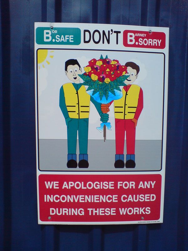
The sign pictured above appears in three places along the hoarding's length. Once at each end, where the footpath ends and large police signs instruct "turn back all ye who walk on this syde of the roade" or the like (actually, to digress for a moment, Stratford could really benefit from some olde worlde wording on signs. Especially the ones which tourists who struggle with the language might need to read in order to find their way into town. More specifically, who might need to find their way to Drucker's, where the purchase of a morning sandwich is becoming an exercise in patience as much as gastronomy) and once again in the middle, where another road joins at right angles. Thus the signs are clearly intended to be read by motorists.
First mistake: lots of words, some small, to be read by speeding drivers. I know Cotswold drivers have a reputation for driving so slowly that animals on the road have more chance of expiring through boredom than percussive impact but even so, this is a lot of text to be reading as you zoom by on your way to Tarquin's school play.
Secondly, this thing is offensively twee. Seriously, you've closed a third of a mile of footpath on a busy residential street - people are unimpressed from the get-go. A token sign apologising does at least set a healthy tone for proceedings but what the hell two line-drawn guys with a bunch of - what are those? The only thing I can imagine which comes in big, round primary-coloured lumps like that is children's cereal and I don't want to get started on that again - is hardly going to mollify any further my simmering aggression towards the developers. Not only is this drawing intrinsically flawed in concept, its execution is still more patronising. Firstly those guys are copy-pasted. Don't believe me? Check out the left-handed buttons on Bob over on the left there. And the freakish kink in his arm where they had to extend it far enough to reach the .. thing that Barney is holding, except a hand width's lower. Sure, some genius changed his mouth a little and re-shaded his hair but basically the message is, "we couldn't be arsed to apologise properly and we're pretty sure a ten minute illustration job by the office temp should make you feel all warm and cuddly and want totrub yourself on our big, masculine demolition equipment."
All this, however, is nothing when you finally come to read the text in full. The lower panel is pulled out of some big clip art library for pretend-contrite building companies but the text at the top is just.. impenetrable. Firstly, why the text-speak initials? It's not as if there isn't room for an 'e' instead of the full stop on either side. I get that they're trying to characterise the twin activities of 'B'ing safe by not entering the construction zone and not 'B'ing sorry for.. wait, we're apologising to you now? Where on Earth did you pull that one from? Why is the "DON'T" neither positioned, nor coloured, to go with either side and therefore to give the impression it goes with both? Am I supposed to be not sorry or not safe? And besides, even if you're aiming for a strangled 'better safe than sorry' motif, where is the mandatory subtitle that actually explains what you mean? All I see is some nonsense about you apologising for my inconvenience. Does this mean you apologise for me being safe? Seriously, was this thing copywritten by a guy who was given a desk job for the day after being smacked on the head by an errant JCB scoop?
Still, however confusing and upsetting this sign may be, at least I can feel reassured by the familiar, calming names of Bob and Barney (written, mind, just small enough that I only noticed them when I stopped to photograph the sign) and trust that they, at least, know what's going on.
After all, they went to all the trouble of serving up some gaudy breakfast cereal on a bed of .. wait, are those asparagus spears or marijuana heads? Oh, wait. I think I've just solved the mystery.
Don't miss..
Other Carl sites
Photo galleries
